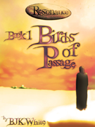
Really intensive but fun day today, formatting Imogen Shroud. There were a couple of things I needed to try, the most important of which was ‘image resolution’. I’ve noticed in a lot of books that the images they use are blurry–too low resolution. Even if you create the image to exactly fit the Kindle’s screen (520 x 622 pixels), it looks a bit rough. It’s better to create an image of twice the resolution you need then let the Kindle shrink it down–this is good for people reading on the iPad or Kindle DX, too. Of course, this meant that I had to resize all of my chapter headings, but most of them needing tweaking anyway. The final result? Well, I’m very happy with it. The chapter headings look great, clean and crisp–for other books I wouldn’t bother, but with this one I wanted to set a certain mood right from the start, and using custom headings really helps with that.
Probably the only thing I’m not quite 100% happy about is the Kindle’s handling of CSS–or rather, non-handling. There are a lot of things it simply won’t do, which makes it quite difficult at times to figure things out. For example, to make sure an image is centred you pretty much have to enclose it in a centred paragraph, which isn’t … I mean, it works, but it’s far from ‘best practice’.
Anyway, it’s all done now, looking good and ready for proofing. I feel like the hard part’s over with, now I can relax a little.
I was also thinking of maybe writing something about formatting, since it seems to be an area that a lot of people have trouble with. Just a basic guideline, nothing fancy, to show that it’s not really anything to be scared of.